Benchmark for Modernity
How George Nelson’s 1947 Platform Bench went from sidepiece to archetype
As published in Herman Miller WHY Magazine
By the mid-1940s, people in and around the New York offices of Fortune magazine had just about had it with Colonial Revival. In 1946, the writer Eric Hodgins published the wry short story "Mr. Blandings Builds His Castle” in its pages, spinning a tale of well-heeled Manhattanites who move to rural Connecticut with their two daughters hoping to cultivate a life of bucolic tranquility. Instead, they find nothing but headaches, structural problems, and lawsuits. (In the 1948 movie that was eventually made from the novel-length version of Hodgins’s story, the father is played to exasperated perfection by Cary Grant.)
Just a few years earlier—or so the story goes—the modernist polymath George Nelson (1908-1986) designed a lean, stylish bench for his Fortune office with the idea that its lack of frippery would encourage visitors to make themselves understood quickly, then be on their way. Whether this origin story is strictly true, the Nelson Platform Bench holds a prime position in the story of Herman Miller itself, both because it’s an indispensable piece of domestic furniture, and because it helps tell the story of how the company helped radically reimagine the postwar domestic landscape in the mid-20th century.
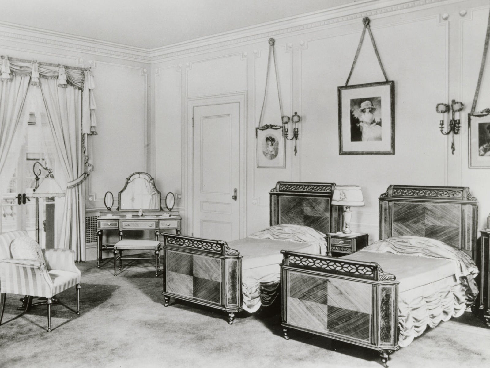
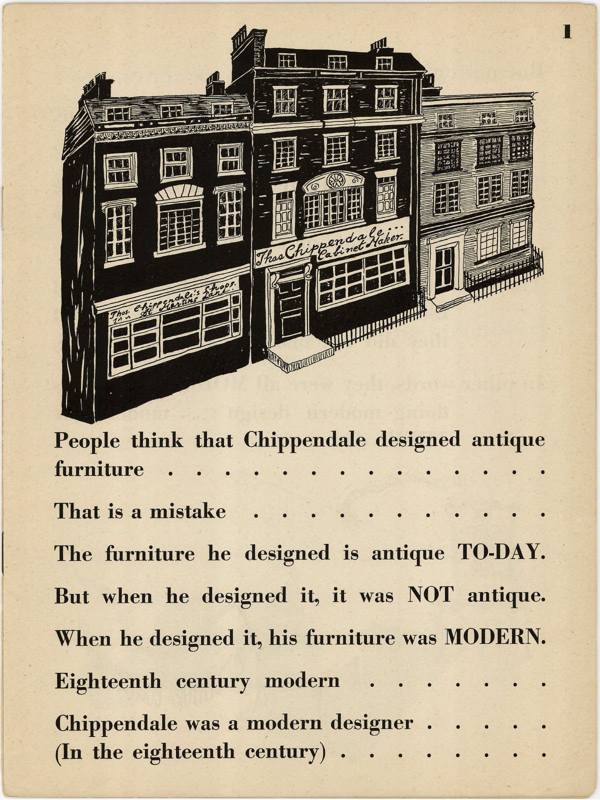
Admirers of midcentury design might be surprised to learn that Herman Miller didn’t start out making modern furniture, nor did George Nelson start out designing it. By the time designer Gilbert Rohde (1984-1944) introduced himself to the company’s president D.J. De Pree at a Grand Rapids showroom in the summer of 1930, the Great Depression threatened to sink both Michigan’s furniture industry and the company itself. Herman Miller had previously enjoyed sustained success by selling suites of furniture to middle-class consumers. This furniture came in an array of historical flavors that could lend a patina of age to a brand-new house. The firm’s in-house designers would study antique furniture catalogs for formal ideas, and produce new dining or bedroom sets in Hepplewhite, Queen Anne, or Chippendale styles.
But what Rohde told De Pree during their initial meeting suggested that the Great Depression may not have been the worst of his problems. Full of enthusiasm for the Bauhaus and the modern designers who were rebuilding war-ravaged Europe, Rohde explained that historically inspired suites of furniture were a thing of the past, and not because Hepplewhite was going out of style. Rather, it was the very concept of a “suite of furniture” that was becoming obsolete. No one is moving into a rambling Victorian mansion anymore, he explained, and no one wants to dust elaborate carving or dangling bits of crystal. He precited the marketplace for high quality, affordable furniture would be dominated by people living in newly built and modestly scaled homes, or in compact urban apartments. The key to winning their loyalty, then, would be flexibility and modularity: different families would need several pieces, perhaps only one, and they’d want options to customize their living space over time as their needs evolve.
Like Rohde, George Nelson was sharply attuned to the big picture of American design—and understood intuitively that the market both shaped and reflected the changing attitudes, technologies, and rhythms of modern life.
An History of Modern Furniture from Prehistoric Times to the Post War Era by Gilbert Rohde, illustrated by Peggy Ann Mack, 1942.
Given what we know today, De Pree’s decision to hire Rohde and follow his advice now looks like a decision shot through with prescience bordering on witchcraft. Not only was Rohde right about the consumer culture of the 1930s (on the limited scale that the Great Depression would allow), he also presaged the boom in postwar home-building and consumer culture in which Herman Miller would become virtually synonymous with cheerily stylish modern living. When Rohde died suddenly aged 50 in 1944, De Pree found himself in need of a new design thinker, and he found it not in a showroom, but in the pages of a magazine. Like Rohde, George Nelson was sharply attuned to the big picture of American design, and understood intuitively that the market both shaped and reflected the changing attitudes, technologies, and rhythms of modern life.
Trained as an architect, Nelson worked primarily as a writer and critic for Fortune, and as an editor at Architectural Forum throughout the 1930s and early ‘40s. Both titles were part of the constellation of Henry Luce’s Time Inc. publishing company, and together formed something like an informal think tank for modern design while Nelson was involved. It was at Time, Inc.—not in a design studio—that Nelson quietly worked on a project for postwar development that would eventually steer him towards Herman Miller.
Storage Wall featured in Life magazine, January 22, 1945.
Nelson worked on what he called “House Ideas” for LIFE and Architectural Forum, and one of the innovations that emerged from this project made a splash on the cover of LIFE in 1944: the Storage Wall. Shown with hands akimbo and a resigned expression, a blonde woman smartly dressed in heels and a day ensemble of separates gazes at a pile of stuff, the doors of the Storage Wall open and waiting to solve her conundrum. But the floor isn’t piled with just any stuff: it’s very specifically the stuff of postwar middle-class life, which is to say, leisure.
Like Rohde before him, Nelson understood that America’s booming consumer culture had carved out a new territory for the modern home. Rational labor and regular work hours meant that people had leisure time, and increasingly, disposable income. Leisure time meant toys, games, books, televisions, radios, tennis rackets, and all the other ephemera that stared down the overwhelmed wife and mother posing with Nelson’s Storage Wall on the cover of LIFE. The magazine article introduced readers to a hypothetical New Jersey family with young children who could spend time near the Storage Wall, at once playing games, reading books, listening to music, and catching up on bills, all in the same room. (One could argue that every picture-perfect 21st century living space that boasts a big open wall of shelves full of technology, books, art, and plants owes a tip of the hat to George Nelson.)
It could be what consumers needed it to be, then, when company arrived, it could be something else.
The innovative Storage Wall inspired D. J. De Pree to get in touch with Nelson in 1944. He knew that old-fashioned “case furniture” as a genre was on the way out, and now he had seen something that could plausibly improve upon it. By 1948, Nelson was writing the introductory essay for his first catalog as Design Director at Herman Miller. And the irony is that one of the Platform Bench’s claims to fame was its elegant role as the supportive base for Nelson’s own case furniture. Though Nelson’s first official collection for Herman Miller premiered in 1948, Nelson conceived of the bench, using it as a platform—quite literally—for the Basic Cabinet Series, which has its conceptual roots in the Storage Wall. Rather than conceiving of his collection in terms of set or suites, Nelson approached case furniture as a group of scalable elements that could work together in inspiring ways.
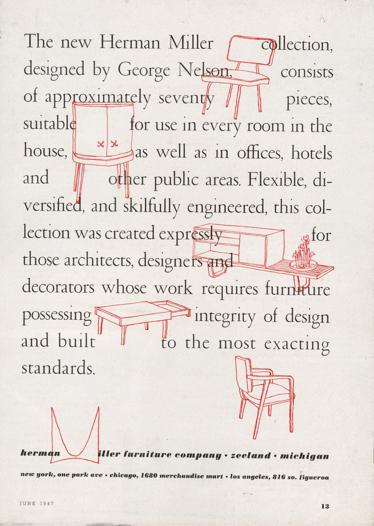
Herman Miller advertisement designed by Irving Harper, 1947.
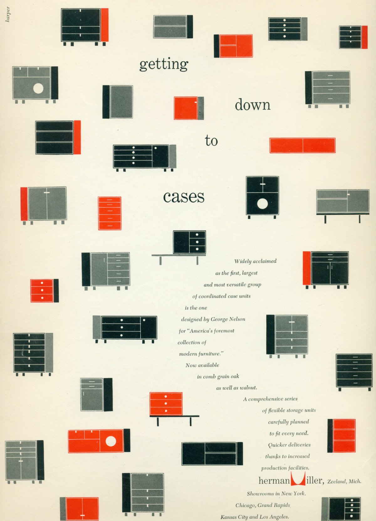
Herman Miller advertisement designed by Irving Harper, 1952.
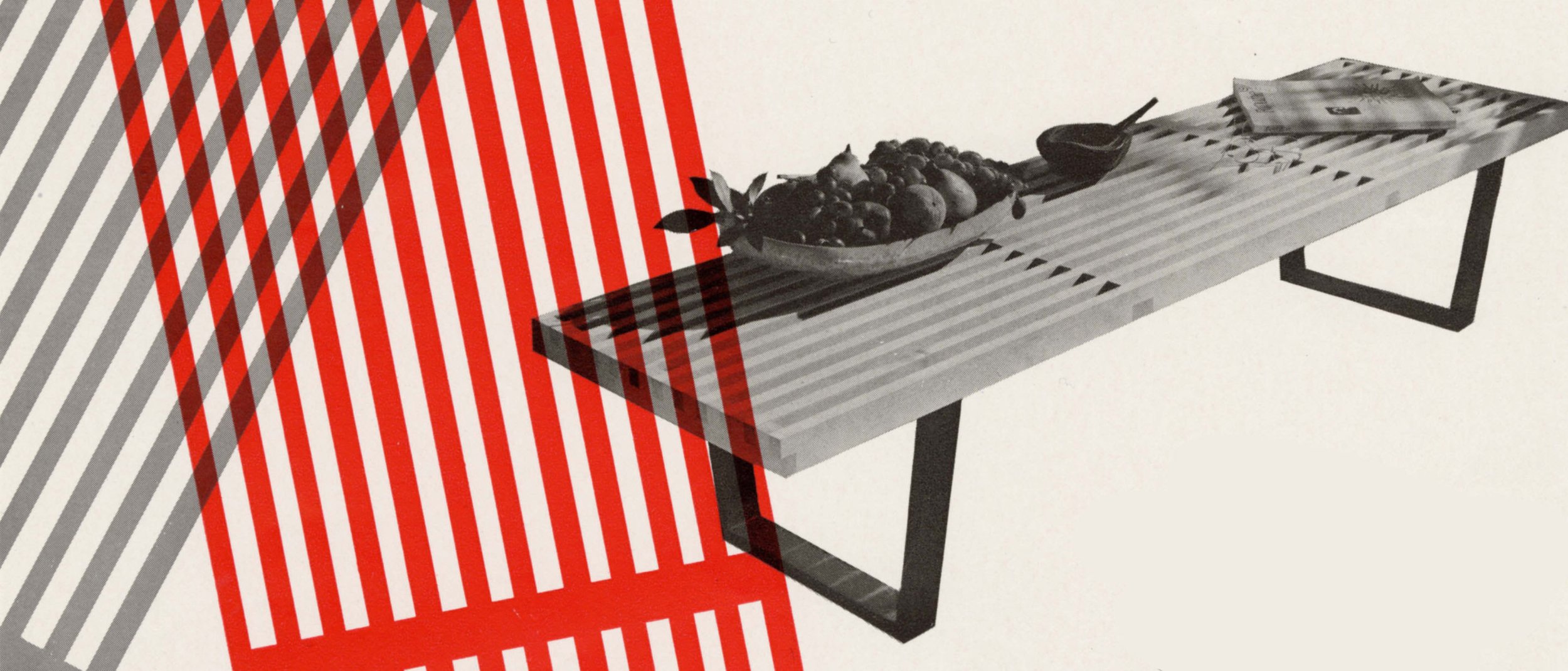
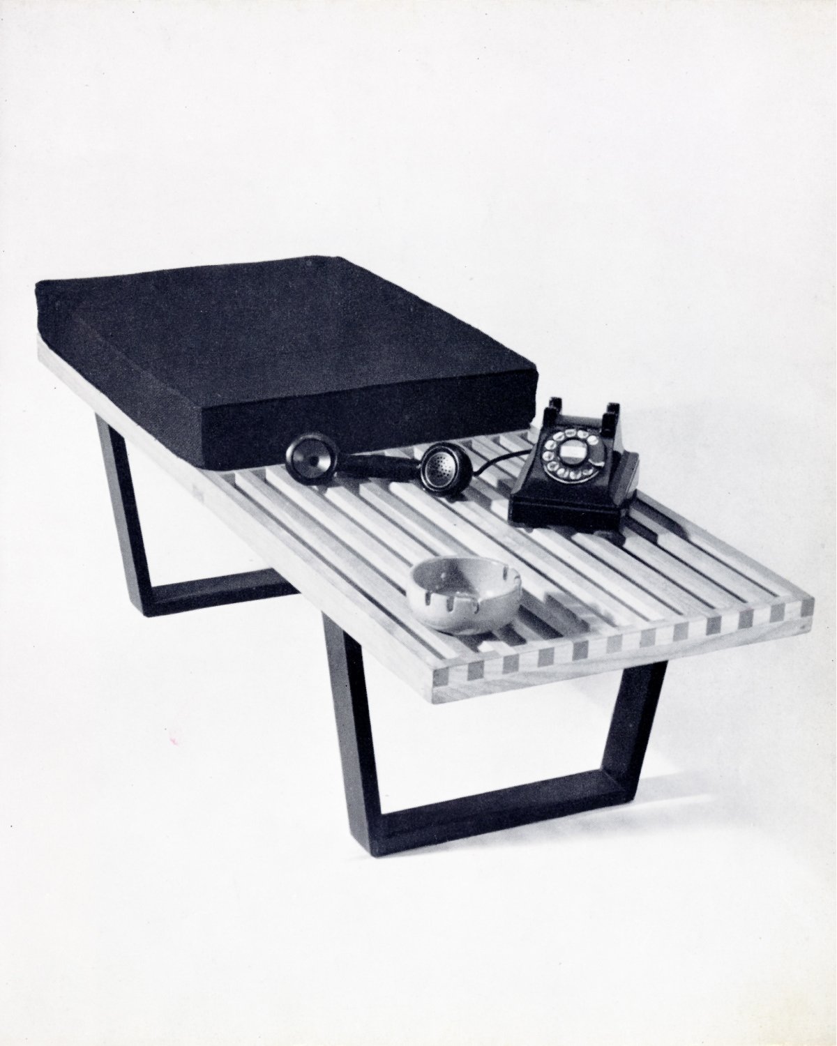
The bench sits on two muscular U-shaped legs, and the surface is made from slats of solid wood with a clear finish. The Nelson Cane Bench, more comfortable and aesthetically warmer than its slat-wooded predecessor, would soon follow in 1952. But on the original, nothing about it is extraneous; every element that you can see has a job to do. The cabinets that could sit atop the bench were multifarious: record players, lighted vanities, and rows shelves could all be elegantly housed inside these new case pieces. The bench itself was described in the 1948 catalog as “primarily a high base for deep and shallow cases, [that could] also serve as a low table for extra seating.”
The Cane Bench was designed for residential spaces and—similar to the Platform Bench—was used for seating, table, and storage applications. It was often paired with Nelson’s Rosewood Group cases (later the Thin Edge Group) and was finished to match. Here the classic classic combo is featured in 1956.
Original Cane Bench drawing from the Nelson Office, c. 1952.
The printed advertisements that showcased the bench in subsequent years (it was in production until 1967, then reintroduced in 1994) demonstrate just how varied its domestic role could be: it’s shown as the support for a bookshelf and houseplant (1954), a television set (1956), and the base for an upholstered settee (1960). It could be what consumers needed it to be, then, when company arrived, it could be something else.
In his 1948 catalog essay, Nelson writes of his predecessor, “The product must be honest. Herman Miller discontinued production of period reproductions almost 12 years ago because its designer, Gilbert Rohde, had convinced the management that imitation of traditional designs was insincere aesthetically. (I couldn’t believe this story when I first heard it, but after my experience of the past few years, I know it is true.)”
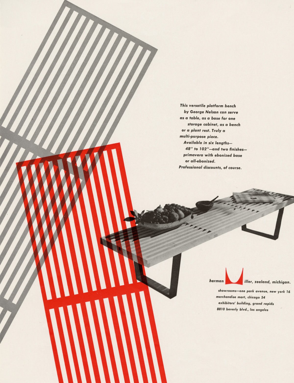
Herman Miller advertisement designed by Irving Harper, 1950.
No. 4691 and 4992 benches with No. 4710, 4711, and 4743 Basic Cabinet Series phonograph cases designed by George Nelson, 1952.
Neither Rohde nor Nelson were likely great proponents of Victorian aesthetics, but what Nelson is echoing here—at least in principle—is among the key tenets of the Arts & Crafts Movement. More than an obsession with Medieval imagery or the rustic look of oak furniture, Arts & Crafts thinkers and makers responded to a glut of ersatz goods flooding the marketplace in the 19th century with the simple plea that things should look like what they really are. The Bauhaus rallying cry of “truth to materials” would give this concept a modern makeover, but the idea is the same: let materials and techniques speak for themselves. Don’t imitate a fancier product, or attempt to disguise something of poor quality as something else.
This ethos is an apt way of thinking about the Platform Bench, which is entirely candid about its construction and material, but it’s also true of Nelson’s approach to design writ large. Rather than building “dream houses” or ideal designs, he wanted most of all to find ingenious solutions that would help people make the most of how they actually live.
Off the Shelf
George Nelson would eventually weave the ideas amassed from his tenure at Time, Inc. into Tomorrow’s House, a book he co-authored with Henry Wright which would land on the New York Times bestseller list in 1945. Echoing the wry domestic critique of Eric Hodgins’s "Mr. Blandings Builds His Castle,” Nelson and Wright were quick to challenge Americans who “drive to business in the newest car, but persist in thinking that a Cape Cod cottage remains the snappiest idea in a home.” Colonial homes were, quite simply, designed by and for people who lived with technology, concerns, and aspirations that were 200 years out of date. Which means that the 1940s vogue for Colonial Revival was nonsensical; not because low ceilings, duck decoys, or dusty blue paint were out of fashion, but because the proportions and layouts of these houses were out of time.
Rather than advocating a particular style, or even making the case for pared down ornament—practically an article of faith among devoted Modernists—Nelson and Wright used Tomorrow’s House to give American readers permission to admit that they had different needs and different stuff from their forebears. Rather than going room by room like a traditional decorating guide, the book is organized according to spheres of activity, from eating and sleeping to play, study, and an intergenerational mode of unstructured hanging out that seemed well-suited to a new place they called “the family room.”

