Here's How Color of the Year Mania Came to Be
The design business may be awash with so-called COTYs, but paint companies still see them as a valuable opportunity to take the industry's pulse.
As published in Architectural Digest, October 15, 2019
In the 1957 romantic comedy Funny Face, Kay Thompson—playing a larger-than-life fashion editor inspired by Diana Vreeland—leads a musical number in which she marshals her staff (and presumably the world at large) to “think pink!” Bolts of Pepto Bismol–colored fabric unfurl across her carpeted office floor as she tells her junior editors to “bury the beige.” As it turns out, Funny Face was right on schedule. In real life, pink was all the rage, dousing everything from a 1957 Ford Thunderbird to a 1957 RCA Whirlpool electric range. The parallel underscored a uniquely 20th-century phenomenon—that colors themselves could have moments.
It can be tempting to think of color trends as mere whim, or—when a trend really takes off—as a lucky stroke of creative genius. But as that other esteemed fictional fashion editor, Miranda Priestly in The Devil Wears Prada, famously schooled her hapless assistant Andy, the colors of consumer products are never an accident. They are deliberately chosen, work their way through retail networks high and low, and end up tinting the wardrobes of even those who claim to be indifferent to fashion.
As with belts and sweaters, so it is with our homes: Over the past decade, more and more legacy paint brands have been unveiling their Colors of the Year (known in the business as “COTYs”) as a way to stake out the company’s distinctive chromatic territory in an ocean of competing hues. The ritual can be traced back to 2000, when Pantone launched its famed COTY with a subtle blue called Cerulean. (Miranda Priestly was right.)
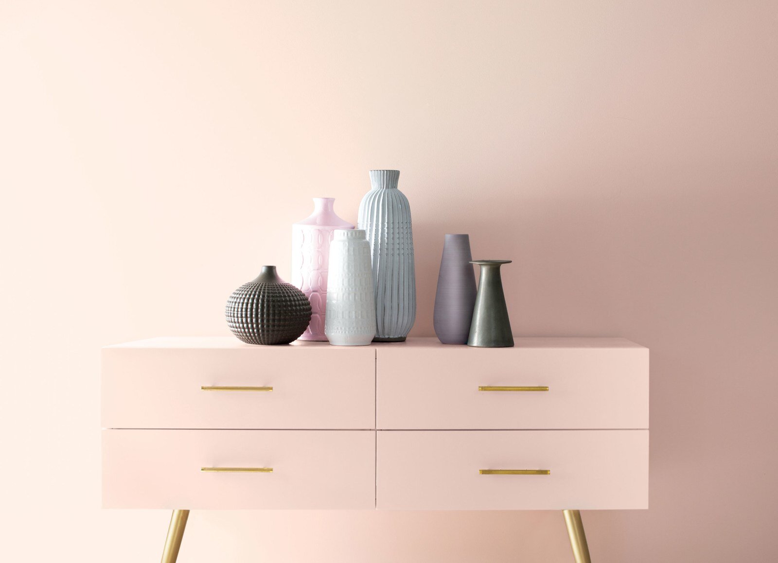
In the years since, COTY announcements have become as ubiquitous as the arrival of pumpkin spice season at Starbucks, with some half a dozen paint manufacturers weighing in every single year. This year alone, variations of green and navy have all been vaunted as the new It color. Other companies, like Valspar, are upping the ante by announcing an entire spectrum of colors, rather than favoring one hue. And just last Thursday, legacy paint brand Benjamin Moore did both: announcing that a soft, blushy pink called First Light is its 2020 COTY as well as unveiling a curated rainbow of pastels and deep blues known as the 2020 Color Trends palette.
Benjamin Moore opts to include this expanded color palette in part because so much valuable color intel is gleaned in the company’s research process. According to Andrea Magno, Benjamin Moore’s director of color marketing and development, “we see it as an opportunity to share the color marketing and development team’s findings from research spanning many industries and countries. When we launch our annual trends palette, we track the impact that the color has made … on social media, sample color chip pulls, and sales.”
In other words, both the COTY and the Color Trends palette are part of a global conversation that flows in both directions: Consumers make it clear what they like, and the company shows them hues they might not have thought to look for. “Our goal is to inspire new ideas around color and possibly to bring a new color idea to the mind of someone embarking on a painting project,” Magno says.
Last Thursday, Benjamin Moore unveiled “First Light" as its 2020 COTY, along with a complementary “Color Trends” palette. Photo: courtesy Benjamin Moore.
With so many competing colors and companies, is the concept of the COTY still important for paint manufacturers? Alan Kemp, head of brand marketing at the U.K.-based wall coverings company Graham & Brown, which launched its first paint collection in 2011, says design and color forecasting are “essential” to the business. “Colors shift in popularity, sometimes subtly, sometimes abruptly—so it is key to monitor not just sales but also potential future trends. Whilst there are evergreens, even safe neutrals shift over time.”
Other companies don’t tend to take the concept of a COTY quite as literally. “The Color of the Year is an important part of our overall emphasis on color authority when talking with consumers and design professionals,” says Sue Wadden, director of color marketing at Sherwin-Williams. “Color of the Year is a great opportunity to talk about key colors in design and where people will be seeing that inspiration in the coming seasons,” she adds. “Color of the Year is about talking color and driving [brand] awareness, not necessarily driving sales.”
And for new start-ups like Backdrop, which was founded in 2018 and has a very tightly edited range of colors, a COTY doesn’t necessarily make sense. Cofounder Natalie Ebel says, “We’ve narrowed down the traditional 3,000-plus colors offered by many legacy paint brands to our launch palette of 50 Backdrop colors, which makes it easy to find your perfect shade.”
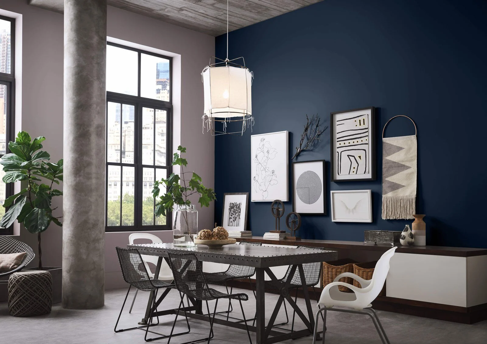
“Naval,” the Sherwin-Williams 2020 COTY. Photo: courtesy Sherwin-Williams.
Paint brands may look to the zeitgeist for inspiration, but there’s no doubt their pronouncements have a big impact on the marketplace. Kemp says that when Graham & Brown introduced its 2017 COTY, a pink called Penelope, searches for “pink” increased on Pinterest by 181 percent. Dee Schlotter, senior color marketing manager at PPG Paints, has observed similar surges: “After PPG’s Color of the Year is named, we tend to see a pretty significant spike in popularity in terms of how often that particular color is purchased in stores.” She adds that the company’s 2018 and 2019 Colors of the Year, Black Flame and Night Watch, saw post-announcement sales increases of 1,100% and 1,475%, respectively.
Do-it-yourselfers might gravitate toward colors of the year as they browse hues in the paint aisle, but do professional interior designers anticipate these annual announcements? Or even make color decisions inspired by them? Not necessarily, says Jamie Drake of Drake/Anderson, who attended Benjamin Moore’s COTY reveal Thursday. “Clients do often request colors that are ‘in’ or ‘trending,’ though I feel they factor into the design process by osmosis too, as they can influence textiles, wall coverings, furniture, and products in general.”
Designer Drew McGukin, also in attendance at the Benjamin Moore soiree, thinks the process involves an ongoing color dialogue between creatives and consumers within the wider marketplace: “I actually believe designers, creatives, and tastemakers are the ones who unknowingly build out the runway for a trending color to launch. In other words, it’s all the moves we’ve been making for some period of time that begin to highlight a color that may be peaking at any given moment. I often use COTY as a guide for mass consumption, then look in other directions that feel fresh and different.”
Whether it’s a true driver of sales or an opportunity to position a paint brand as a color authority, the COTY can’t arrive too early or too late. “It’s about timing when forecasting Colors of the Year,” says Sue Kim, Valspar’s color marketing manager. “Our goal is to select colors at the beginning of the peak in popularity. Trending colors get exposure in the media, and start to become accepted colors to use in the home, which allows the colors to have longevity for years to come.”
Graham & Brown, a wallcoverings company that got into the paint business eight years ago, unveiled “Adeline," a forest green, as its 2020 COTY. Photo: courtesy Graham & Brown.
And of course, none of this happens in a vacuum: Color choices are always inspired, consciously or not, by the global mood. “[Colors] are completely reflections of what is going on,” says Graham & Brown’s Kemp. “Adeline [a classic forest green] was chosen this year because the color is evocative of the Victorian boho era and the trend for biophilia, bringing the outside in, and creating a calming sense of well-being. We see the reasoning behind these particular trends to be in times of economic and political upheaval, in which people tend to feel nostalgic and reach back in time to artisan products, with quality and craftsmanship being key.”
Magno, of Benjamin Moore, echoes this observation. “We’ve looked back through major periods in history to see where there are commonalities between the events happening in the world and the colors that are most popular,” she says. “Generally speaking, we see periods of unrest associated with more muted colors that feel safe and grounded, while in times of optimism and prosperity the color choices are upbeat and lively.”
Schlotter, of PPG, echoes these findings. “The increasing need for connection in an unmoored world was a recurring theme at the recent PPG Global Color Workshop,” she explains, referencing the company’s annual multidisciplinary summit to determine its annual color forecast. The verdict was clear: People—in particular millenials and women—are anxious and craving reassurance. So, PPG is championing calm in the form of Chinese Porcelain in 2020. “This soothing blue imparts slowness, encouraging consumers to practice mindfulness and be more present in their lives while also offering the spirit of hopefulness,” Schlotter adds, “a precious commodity in a restless world.”
But Glidden (part of PPG's portfolio) seeks to find calm in other places—mainly, by encouraging its customers to stop tearing their hair out over paint decisions. In fact, this year it announced that it was dropping out of the COTY race entirely. As the brand’s resident “color guru” Kim Perry bluntly stated in a press release, cheekily timed to National Procrastination Day on September 6, “Grays have been trending for more than a decade.... Instead of staring blankly at a paint color card questioning all your life choices, you can spend time doing what you really want to do. Like drinking wine or binge-watching TV in your freshly painted living room.”


