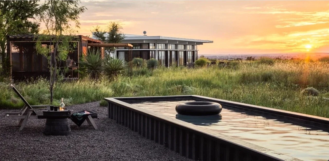
Palm Springs is a multicolored marvel in the desert, and visiting—especially during Palm Springs Modernism Week—can feel like stepping out of a time machine and into a Doris Day movie. Perched at the edge of California’s Coachella Valley, a dry, rocky landscape gives the surroundings of this city of about 45,000 people a muted color palette, but the vivid hues of midcentury-modern architecture (think canary yellow front doors, crisp white breeze blocks, and the occasional pink flamingo) give it the feel of a Slim Aarons photograph come to life.
Read MoreGaze into an antique mirror—you know you want to—and imagine what the interior design trends for 2025 might be. What do you see? If you’ve followed AD PRO’s reporting on color trends, or checked in on the wellness amenities, AD100-approved retro designs, or in-demand layouts covered in AD PRO’s member-exclusive 2025 Interior Design Forecast, you probably have some idea. (Hint: Tactile and natural materials like terra-cotta and rattan aren’t going anywhere.),
Read MoreThere are certain decorating tropes—wall-to-wall carpet, mirror walls, conversation pits, chintz fabric—that remain consistent in their ability to elicit strong feelings but tend to wax and wane in genuine popularity. They follow larger trends, and their fortunes rise and fall at the mercy of the marketplace. What seems charming and idiosyncratic one moment (cottagecore, anyone?) seems dated and overly fussy the next. One trend that illustrates this perfectly is the curiously retro practice of skirting furniture, which has been having a moment for a few years now and accumulating on mood boards and showroom floors.
Read MoreCeilings can, and should, dazzle. A stellar example can signal thoughtfulness about the design of a whole space, and function as a kind of decorating Easter egg: Look up, and you might be rewarded with gestures of wit, virtuosic craft, optical tricks, or sumptuous color. So what ceiling trends are raising the roof right now? We spoke with inventive designers with distinctly different aesthetic points of view to find out what inspires them when it comes to designing a room’s fifth wall.
Read MoreIn the mid 1930s, legendary Vogue editor in chief Diana Vreeland began writing a column for Harper’s Bazaar called Why Don’t You? in which she would encourage readers to try something new, almost as an absurdly glamorous dare. Among her suggestions was the idea that readers might decorate their homes entirely in green, with a verdant mix of houseplants and glazed porcelain. But Vreeland’s personal favorite color was red, specifically “the color of a child’s cap in any Renaissance portrait.”
Read MoreKitchen technology is evolving apace, with AI and other innovations pushing products ever closer to Jetsons territory. But some of the hottest kitchen trends right now have a distinctly vintage feel, from archival tile colors to retro flooring and the return of the breakfast bar. We asked some busy architects and designers what trends they’ve spotted so far in 2024.
Read MoreWhat’s the first thing you would do if you learned that a cataclysmic disaster was about to unfold? If there was no cell service and you couldn’t reach your loved ones, you might reach for a go-bag, a portable generator, or a liferaft. If you frequently think about disaster preparedness and doomsday design (it’s difficult not to these days), you might conceive of your home either as a potential emergency shelter, or as a place from which you might have to evacuate one day. Since the advent of the nuclear age, we’ve become accustomed to thinking of “the end of the world” in a terrifyingly literal way, less as one of several surmountable calamities, and more like a hard stop on civilization itself: doomsday.
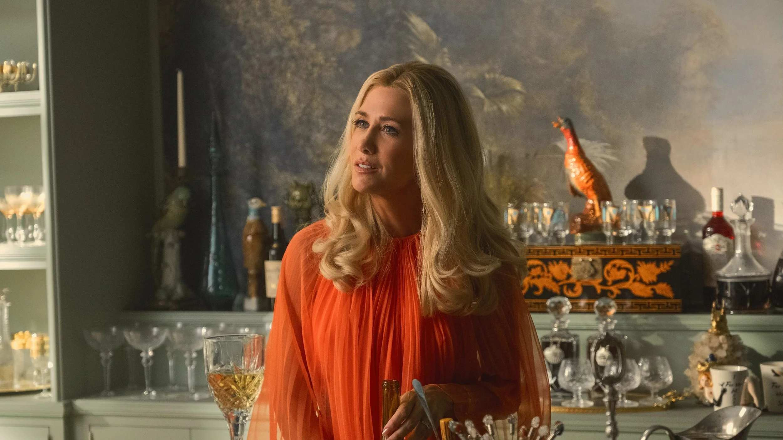
Read MoreGiven the verbal prompt “Palm Beach in the late 1960s,” your mind’s eye would undoubtedly conjure something fabulous. But this imaginary Florida aerie wouldn’t conform to one specific style, like Art Deco or Hollywood Regency; it would probably be a layered mix of Spanish-style architecture with chinoiserie furniture in a Lilly Pulitzer color palette. Palm Beach style evolved from a unique mix of 20th-century architectural movements, which combined in a way that tells the story of its clientele and shifting tastes. So for production designer Jon Carlos and set decorator Ellen Reede, bringing the tropical technicolor world of the new Apple TV+ series Palm Royale to life was a challenge full of historical rabbit holes and creative complexity.
Read MoreIn 1913, the designer Elsie de Wolfe published a book that would become a classic of interior design, a profession she helped create during her long career. Entitled The House in Good Taste, its mission could not have been more clear: De Wolfe wished to see American interiors brightened up, styled with a confident point of view, and cleared of the Victorian clutter that crowded so many 19th-century homes with fringe, cut velvet, seashells, and elaborate wood carving.
Read MoreThere is something irresistible about the ugly duckling, even before its grand metamorphosis into (spoiler alert) an adult swan. He’s gangly, his feathers look weird, his proportions are off, and every other animal he encounters on his journey notices this and comments on it. The moral of this beloved fairy tale is that beauty and its antithesis, ugliness, are meaningful only in context. The “ugly” duckling was just the victim of a temporary category error, he wasn’t actually ugly.
Read MoreIts name doesn’t inspire a sense of coziness, comfort, or even glamour, yet Brutalist architecture—the postwar style that pinned its hopes on the possibilities of poured concrete—seems to be back in the zeitgeist. Of course, it never really left: For decades, its detractors have been waging a war of attrition against its somewhat severe and aggressively modernist aesthetic with a policy tactic known as “active neglect.” Boston’s City Hall has been controversial since it was unveiled in 1968.
Read MoreIt can’t be a coincidence: rising interest rates, worries about inflation and the price of gas, and the triumphant return of the disco ball and the blob sofa all in the same year? Could it be that midcentury-modern style has decided to take a much-needed rest? Avant-garde Italian furniture from the 1970s, smoked glass, conversation pits, earthy colors, and wall-to-wall carpeting all appear to be back with gusto.
Read MoreSwimming pools seem like a great idea when a summer heat wave hits, but with the excavation and expense involved in the construction of a traditional in-ground pool, they don’t provide a last-minute solution. That’s why a once-maligned marvel of early-20th-century design—the aboveground pool—is finally enjoying its moment.
Read MoreHamlet VIII, the lobby cat of the Algonquin Hotel in New York City, is arguably the longest-standing resident of the legendary auberge. So when a recent renovation of the property came to pass, Stonehill Taylor applied concepts of cat-friendly design to ensure that he and the inn’s more temporary guests could live in harmony.
Read MoreScholars’ gardens, haciendas, glass-enclosed greenhouses: There’s nothing quite so magical as a private garden space where plants and flowers thrive, secluded from everyone except the birds, butterflies, and those few humans in possession of a key. Gramercy Park, the famed two-acre landscape in Manhattan that’s accessible to only those who live in immediately surrounding buildings, sets the precedent when it comes to private green spaces in the city. Rare other examples, such as the Macdougal-Sullivan garden that connects 21 row houses in Greenwich Village, are equally celebrated—and coveted.
Read More“Back to school”—a phrase that evokes fresh school supplies, new backpacks, and delighted parents—sounds a lot different this year, as millions of students across the country start classes from their homes. When the COVID-19 pandemic sent schools into virtual mode back in March, families scrambled to get up to speed on telecommuting technologies, carve out makeshift desk space in their homes, and keep kids and pets from making unplanned cameos in their remote work meetings.
Read MoreFor decades, the American dream kitchen has been covered in gleaming white surfaces, from subway tile to countertops to cabinets. Save for a few historic blips—think pink and turquoise in the post–World War II years, and avocado green and harvest gold in the ’60s and ’70s—white has remained the default choice for kitchen design, most recently embodied by the Pinterest-approved trend of light and bright cooking and dining spaces.
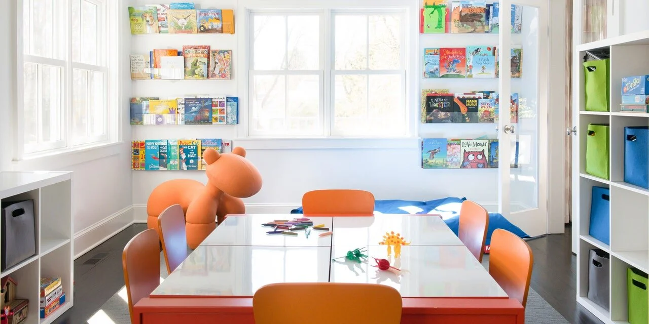
Read MoreBusiness partners Denise Davies and Karri Bowen-Poole initially connected in the digital realm (“it was Instagram love at first sight,” they wrote in an email), but they eventually teamed up last year to bring a more analog endeavor to life: designing custom educational playrooms that mix good design with a smorgasbord of opportunities for play, an endeavor they dubbed Smart D2 Playrooms.
Read MoreHow do we want to live? That’s the question that has driven designers and architects for as long as human beings have been building and customizing their dwellings. A timely new exhibition called “Home Stories: 100 Years, 20 Visionary Interiors,” opening February 8 at the Vitra Design Museum in Weil am Rhein, Germany, provides a fascinating look at how designers have tried to answer this question over the past century.
Read MoreIn the 1957 romantic comedy Funny Face, Kay Thompson—playing a larger-than-life fashion editor inspired by Diana Vreeland—leads a musical number in which she marshals her staff (and presumably the world at large) to “think pink!” Bolts of Pepto Bismol–colored fabric unfurl across her carpeted office floor as she tells her junior editors to “bury the beige.”
Read More


