4 Ceiling Trends That Give New Weight to the “Fifth Wall”
Look up! Ceilings are cooler than ever—here are four ideas for making one stand out
As published in Architectural Digest, AUgust, 2024
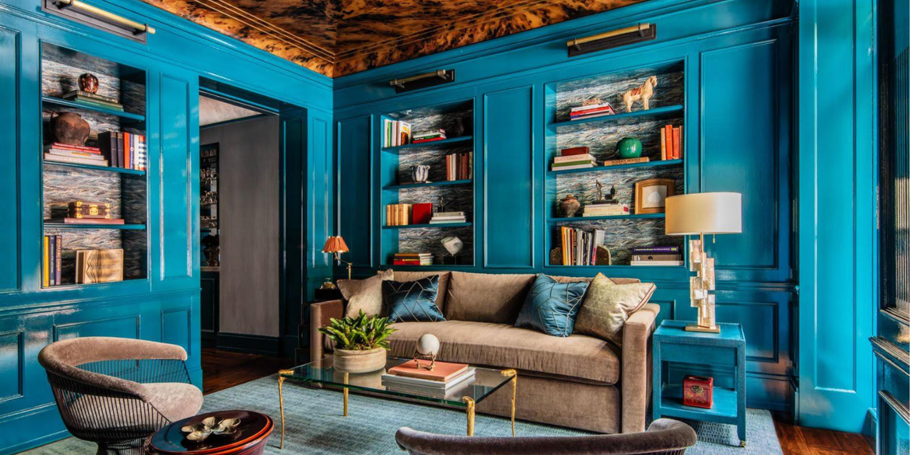
AD PRO Directory-listed firm James Thomas applied a faux tortoiseshell ceiling in this Gold Coast library. Courtesy James Thomas.
Ceilings can, and should, dazzle. A stellar example can signal thoughtfulness about the design of a whole space, and function as a kind of decorating Easter egg: Look up, and you might be rewarded with gestures of wit, virtuosic craft, optical tricks, or sumptuous color. So what ceiling trends are raising the roof right now? We spoke with inventive designers with distinctly different aesthetic points of view to find out what inspires them when it comes to designing a room’s fifth wall.
Geometry and Not-Plain Planes
Playing with color, form, and geometry can give a ceiling movement and verve. London-based Studio Vero chose to make the most of a low ceiling on the ground floor of a West London residence. “This space is a little anteroom on the lower ground floor that leads to a garden—it has a low ceiling and could have been something of a forgotten room, so we wanted to turn it into something special,” says partner Venetia Rudebeck. The team layered stripes, embraced vivid colors, and—on the ceiling—created a flat version of a classic circus tent with a green lighting fixture from Urban Electric that recalls the satisfyingly plump cylinders of Irving Harper’s 1956 Marshmallow Sofa. “As the room connects to the garden and has a home bar in it, it brings in the element of fun in the way it’s almost tent-like, yet it’s been done in a sophisticated way—with the antique table and the chairs from Martin Brudnizki’s And Objects—it’s playful but feels very smart at the same time,” adds Rudebeck.
In a small space, like the anteroom Studio Vero took on in this West London flat, going for a bold ceiling treatment can pack a stylish wallop. Simon Brown courtesy of Studio Vero
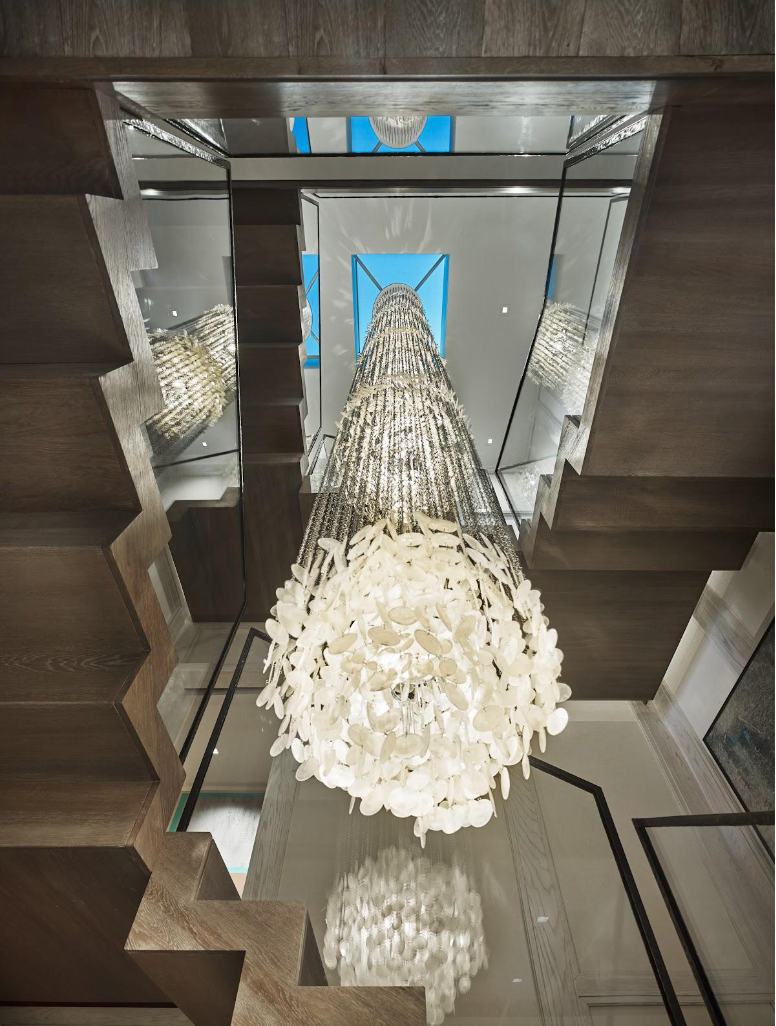
Clever use of multi-floor depth can make a space that might otherwise be overlooked into the centerpiece of an interior. Marco Angelucci of Marguerite Rodgers in Philadelphia recently used a stairwell with a skylight to frame a dramatic lighting fixture, thus bringing two forms of illumination into the interior. “Don’t limit yourself to walls when thinking about ways to let natural light into a space,” Angelucci advises. “A skylight can do the job too while displaying the ever-changing sky. It’s artwork for the ceiling.”
Marguerite Rodgers in Philadelphia used a stairwell’s skylight to dramatic effect. Halkin Mason courtesy of Marguerite Rodgers
Think of a skylight like “artwork for the ceiling,” says Marco Angelucci of Marguerite Rodgers. Halkin Mason courtesy of Marguerite Rodgers
Art History
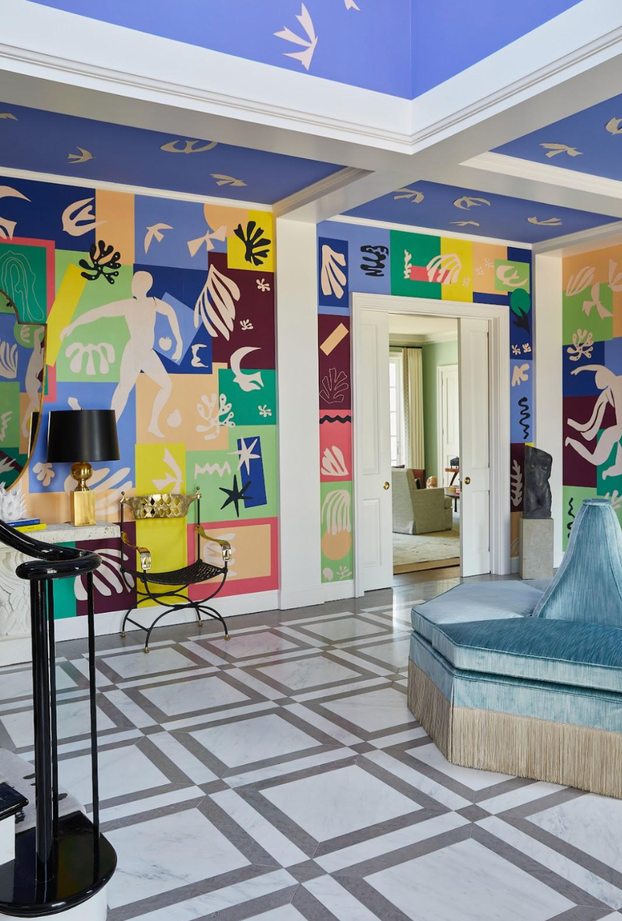
Architectural history is full of examples of ceilings as the canvases for great works, from Giotto’s deep blue starry-sky masterpiece inside the Scrovegni Chapel in Padua to the dazzlingly complex carved stone ceiling of the Hall of Kings in the Alhambra palace in Granada. Designers can draw on centuries of inspiration when it comes to anchoring ceiling trends in historical context. Chicago-based designer Sarah Vaile studied Henri Matisse’s paper cutouts as she crafted her entry hall for the 2023 Lake Forest Showhouse; working closely with a decorative artist, she placed linen appliqués in the shape of paper birds on the ceiling of the two-story space, making it seem as though the birds were flying upwards from the colorful Matisse-inspired wallpaper by DeGournay.
Henri Matisse’s famous cutouts served as the jumping-off point for this colorful entryway by Sarah Vaile for the Lake Forest Showhouse.
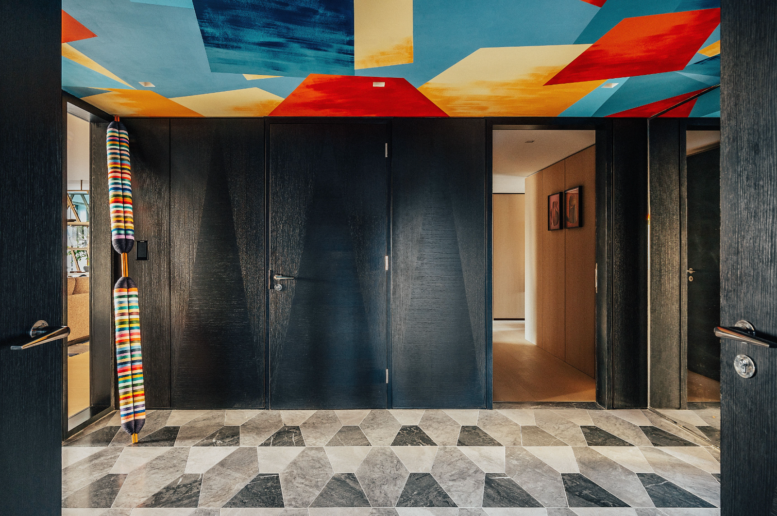
With the chromatic splendor of a 20th-century Color Field painting, Ed O’Donnell of London-based firm Angel O’Donnell commissioned the London Mural Company to create a saturated abstract painting on the ceiling of a three-bedroom residence inside the notable Brutalist skyscraper Centre Point. Describing it as a “canopy of color,” O’Donnell notes that the mural’s design was inspired in part by the shapes of the stones that pave the entryway. “The large rhomboidal shapes abstractly reflect the geometrically-patterned limestone floors. The richly pigmented colors capture the spectrum of cool and red-hot hues that pour in through the east- and west-facing windows from sunrise to sunset,” he tells AD PRO. “And the whole piece surprises and delights, not least of all because it vibrantly contrasts with the iconic Brutalist landmark it lives in.”
At Centre Point in London, Angel O’Donnell commissioned a multicolor ceiling painting from the London Mural Company. Taran Wilkhu courtesy of Angel O'Donnell
The Raw and the Cooked: Industrial
Urban lofts are known for their maze of exposed pipes and ductwork. Though some designers will choose to cover up the visual clutter, others use it as inspiration for clever ceiling treatments. Case in point: A Lower East Side apartment by Builtin Studio has a shimmering dropped ceiling with visible rivets that elegantly disguises some unsightly ductwork that couldn’t be moved. “The clients for this project had quite eclectic taste, which gave us the opportunity to be a little experimental,” says Builtin’s Gary Eisner. “We had exposed ductwork running throughout the home. With that element, which cannot really be ignored, we decided to lean into that language, carrying more of the metal finish in this dropped ceiling.”
The metallic ceiling of this Lower East Side apartment by Builtin Studio helps to disguise ductwork. Jeff Cate courtesy of Builtin
For an apartment on Perry Street in New York City’s West Village, the team at Banda was assigned the delicate balancing act of mixing elements of industrial grit with luxurious refinement. The coffered ceiling in the dining room provided the perfect place to leave some of the loft’s original raw concrete, tamed by a distinct perimeter. “We retained the concrete ceiling so the space stays true to its industrial loft–style heritage and introduced softer, more colorful elements such as leather, linen, and mohair to add contrast,” says Nicola Sherbon, Banda’s head of design. An eye-catching lighting fixture from Apparatus fills in the space above a custom Downing Street dining table.
Designers needn’t hide industrial nitty-gritty in an interior—by contextualizing it with polished features, as Banda did with this coffered ceiling layered over concrete, existing elements can feel elevated and unique. Nicole Franzen
Old-World Craftsmanship
One of the virtues of a 19th-century house is the intricate plasterwork on the cornices and ceilings, assuming it has been preserved, even by neglect. In a spectacular space, sometimes it’s worth it to restore this kind of decoration to maintain the character and proportions of a historic space. In an early Victorian flat in London, De Rosee Sa’s restoration of cornicing contributed greatly to reviving the original character of the property, says Claire Sá, the studio’s cofounder and director. Those details turned out to be the perfect foil for a contemporary kitchen: “The highly decorative detail and substantial scale of this cornice help to balance the very high ceilings in the rooms and contrast with the more contemporary lines of the kitchen and joinery elements,” she adds. “It is very important to get the scale of skirtings, moldings, and especially cornices right in a room.”
Restored cornicing in this London home by De Rosee Sa helps to bring back some of the structure’s original character. Richard Green courtesy of De Rosee Sa
The details offer chic contrast with some of the home’s more modern millwork. Richard Green courtesy of De Rosee Sa
And for sheer dramatic effect, don’t underestimate the power of old-fashioned faux bois or decorative painting. James Dolenc and Tom Riker of AD PRO Directory–listed firm James Thomas love to use bold color in their work, and for a recent project in Chicago, they used a high-gloss paint to create the look of tortoiseshell on a library ceiling. Set off against vivid cerulean blue walls, this unexpected ceiling alludes to a natural material that’s full of character and evokes another era—perfect for contemplating the atmosphere and plot twists of a 19th-century novel.


