The Visionary Interiors That Shaped the Way We Live
A new show at the Vitra Design Museum on view next month highlights 20 game-changing interiors—from Elsie de Wolfe’s Villa Trianon to Andy Warhol’s Factory.
As published in Architectural Digest, January 30, 2020
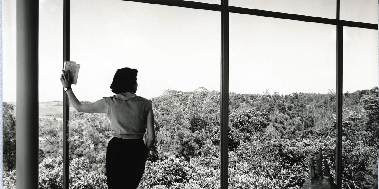
Architect Lina Bo Bardi surveys the view from her Casa de Vidro in São Paulo, Brazil—one of 20 pioneering interiors showcased in the Vitra Design Museum's latest show. Photo: Francisco Albuquerque; courtesy Instituto Bardi / Casa de Vidro
How do we want to live? That’s the question that has driven designers and architects for as long as human beings have been building and customizing their dwellings. A timely new exhibition called “Home Stories: 100 Years, 20 Visionary Interiors,” opening February 8 at the Vitra Design Museum in Weil am Rhein, Germany, provides a fascinating look at how designers have tried to answer this question over the past century. Organized by curator Jochen Eisenbrand and assistant curator Anna-Mea Hoffmann, the exhibition explores the dominant themes of interior design through the lens of trailblazing spaces.
A scene from Elsie de Wolfe's 80th birthday party, celebrated in 1938 at her sumptuous home, Villa Trianon, in Versailles, France. Photo: Roger Schall; courtesy Jean-Frédéric Schall
Though people have been designing buildings, interiors, and furnishings for millennia, it’s only since the early 20th century that interior design came to be understood as a profession. Appropriately, “Home Stories” begins with the work of Elsie de Wolfe, the society decorator whose 1913 book The House in Good Taste captured the new, light-filled aesthetic of the Edwardian era as people sought to shake off the clutter and fussiness of the Victorian period.
Verner Panton's trippy Phantasy Landscape (1970), first shown at Visiona 2 in Cologne, Germany, will be reconstructed at the Vitra Design Museum show. Photo: Verner Panton Design AG, Basel
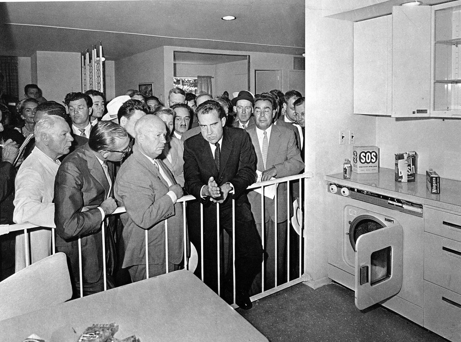
The case studies that follow, ranging from de Wolfe’s Villa Trianon to Andy Warhol’s Silver Factory, are represented through models, drawings, photographs, and films that capture the spirit of each work (the one exception is a re-creation of Verner Panton’s psychedelic “Visiona 2” interior, in which visitors can walk around and explore). These interiors are about more than just domesticity, the show asserts; they were pivot points in economics, industrialization, and politics. Architect Margarete Schütte-Lihotzky’s 1926 Frankfurt Kitchen, for example, crystallized a moment when the logic of an efficient, modern factory floor infiltrated the home. A model home displayed at the American National Exhibition in Moscow in 1959, meanwhile, became a proxy for soft power after Vice President Richard Nixon got into an impromptu debate with Soviet Premier Nikita Khrushchev about the nature of domestic work.
Richard Nixon and Nikita Khrushchev during the famous 1959 “Kitchen Debate” at the American National Exhibition in Moscow. Photo: Picture Alliance / Associated Press
The exhibition looks forward, too: questions about resource consumption and climate change give it a sense of urgency and seriousness. A close look at the history and evolution of IKEA is especially intriguing as we begin to reconsider the cost of fast fashion and, indeed, of “fast furniture” at a critical moment for the planet. AD PRO reached out to Eisenbrand, the curator, to get a sense of how the project took shape, and what the Vitra Design Museum hopes visitors will learn from this exhibition.
There’s such an interesting mix in this exhibition of rarefied and eccentric interiors, like Andy Warhol’s factory, and accessible mass-market goods like IKEA, with which everyone has some experience. Was this a deliberate juxtaposition to demonstrate how ideas about interior design cut across class?
Jochen Eisenbrand Photo: Lucia Hunziker
We want to show that there are many different factors that influence the way we live at home and how we furnish our homes. There are pioneering architects and designers that lead the way or were the first to recognize new social or technological currents. They designed interiors to reflect those ideas and they kind of trickle down over the course of some years. Then there are artists who may not even have been thinking about interiors but nevertheless promoted a different way of living. And then there are, of course, general social, economical, or technological developments that also directly influence the way we live at home. Being the largest furniture manufacturer worldwide and selling furniture on a global scale, IKEA is certainly also an agent in this context—in ways both good and bad.
The postwar interiors offer such a contrasting set of approaches that range from a focus on nature, as in the work of Lina Bo Bardi, to the typical American kitchen on display at the American National Exhibition in Moscow in 1959, which presents machines as life-changing and time-saving devices. What does it say about this era that such different interiors were seen as ideal?
I am not even sure if these were such polar opposites. For instance, Bo Bardi, when her Casa de Vidro was completed, had herself photographed in the house in front of the large glass panes overlooking untouched nature (which was actually retouched in the photograph to look even more untouched) or in her garden amidst the plants; at the same time she (or another woman; the face is not visible) posed in the kitchen for photographs to present all the new amenities the kitchen had to offer. Or take the House of the Future by Alison and Peter Smithson: an all-automated show house, nearly closed off to the surrounding neighborhood but with a private little garden in the interior courtyard. Maybe the time gained through the automated household was to be spent in the garden.
The success of organic design at this time—organic in terms of shapes derived from nature, but also in the sense that natural materials were used—was, however, in a way also a political reaction because steel and glass were materials associated with the modernism that came out of Germany in the 1920s and 1930s and hence also with dictatorship and the war.
Lina Bo Bardi's verdant Casa de Vidro (1952) in São Paulo, Brazil. Photo: Nelson Kon
What can designers working today and facing challenges like climate change or urban housing shortages learn from some of the interiors in this exhibition, and the ideas that shaped them? I’m thinking especially of the Nakagin Capsule Tower by Kisho Kurokawa.
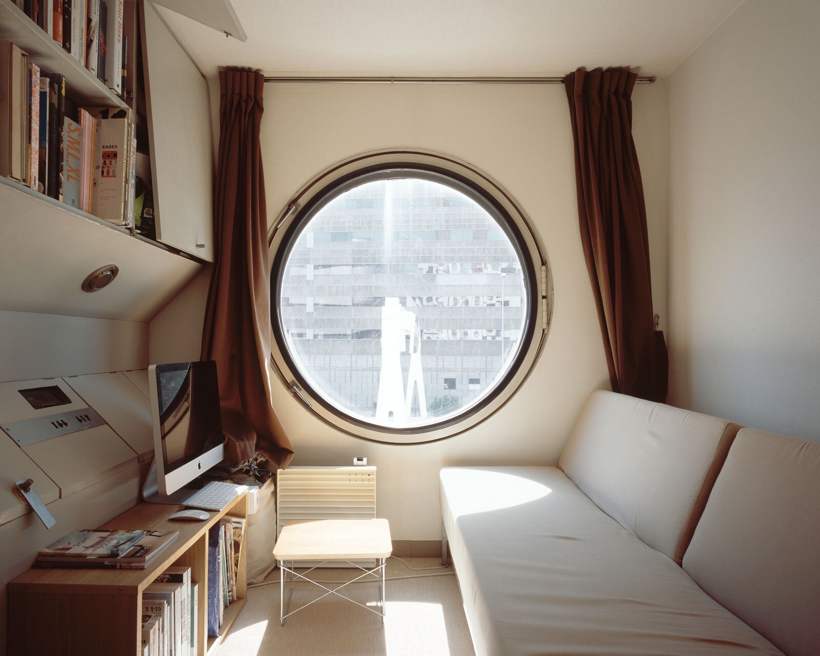
This is a tough one. The Nakagin Capsule Tower [a 1972 mixed-use building composed of prefabricated pods] is a fascinating project, but it may tell us more about the limits of architectural planning. The capsules were supposed to be exchangeable, but that would have only made sense if there would have been other towers somewhere else to serve as their infrastructure.
A view inside one of the pods that make up Kisho Kurokawa's Nakagin Capsule Tower. In theory, the prefab units could be reconfigured according to the inhabitant's needs. Photo: Noritaka Minami
More generally speaking, we hope that looking at all the examples in the exhibition and reflecting on both their timeless qualities and qualities that are very much of their time will help people more clearly see to which degree our interiors today reflect actual needs, but also to which degree they are still leftovers from another time.
We are, by the way, also showing a few very recent examples and they advocate a new sensibility towards energy consumption, like Arno Brandlhuber’s Antivilla or reusing and repurposing existing houses for today’s needs rather than tearing them down, like London-based studio Assemble’s Granby Four Streets project.
Andy Warhol in his iconic Silver Factory. The live/work space went on to forever shape loft-style living. Photo: Nat Finkelstein
Of the interiors in the exhibition, do you have a favorite, either aesthetically or conceptually? If so, which one?
I found it highly interesting to learn more about Warhol’s Silver Factory and to try and look a bit behind this mystical space. It is very intriguing on so many levels, as a space of appropriation; a space where living, working, and partying came together; a new type of artist studio and early example of loft living. It’s also a completely mediated space because of Warhol’s films and all the photographers who spent time there.


